Space view
Overview
A Space View displays data to users and offers core data collaboration features, including defining the display format for specific data columns and enabling quick filter setup.
Create a space view
Note that creating a space view is distinct from attaching it to a space page for navigation. There are two ways to create a space view:
- Create only space view: This option, located in the space actions menu (the "gear" icon in the space navigation), creates a standalone view that can be attached to one or more pages within the space later.
- Create space view and attach it to page: This is typically done during the creation of a "space view" type page. In this process, you can choose to either attach the new page to an existing space view or create a new space view to attach to the page.
Here we will review the first method. The second method can be reviewed in the space page documentation.
To create a space view, navigate to a space and click on the "gear" icon on top of the space navigation bar. Select "Create Space View" from the menu.
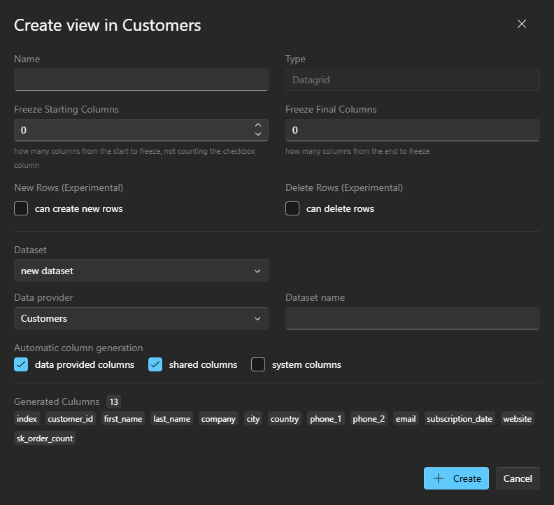
On the modal form, provide the following information:
- Name: The user-facing name of this view.
- Type: Currently, only
DataGridis available. Future updates will include options for presenting data with charts. - Freeze Starting Columns: Specify the number of initial columns to freeze, keeping them visible during horizontal scrolling.
- Freeze Final Columns: Specify the number of ending columns to freeze, ensuring they remain visible during horizontal scrolling.
- New Rows: (Experimental) Enable users to add new rows to the data.
- Delete Rows: (Experimental) Enable users to delete existing rows from the data.
- Dataset: Choose whether to use an existing dataset within this space or create a new one for this view.
- Automatic column generation: Indicate whether the system should automatically create the view columns.
Manage a space view
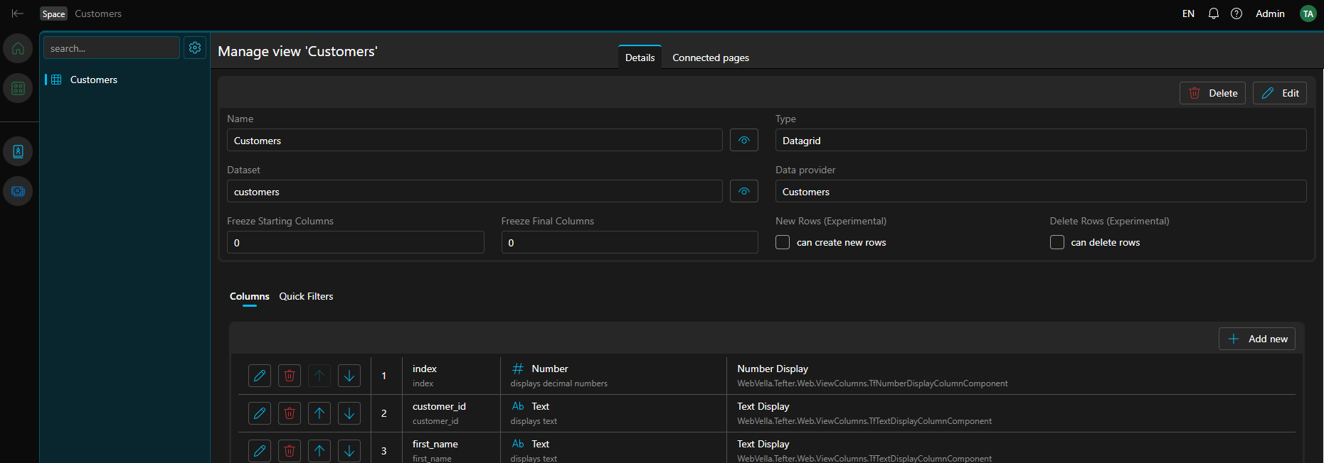
To manage a view, you need to navigate to its space, and click on the "gear" icon on the top of the space navigation bar. In the menu select "Space view list" and once the list of all views in this space are presented, select the one you need. The space view management page contains four sections:
- Details: Displays general information such as the view's name, the dataset it uses, and its data provider.
- Connected pages: Lists all pages linked to this view, with options to navigate to them.
- Columns: Shows the list of columns in the view, allowing you to manage, reorder, or remove them.
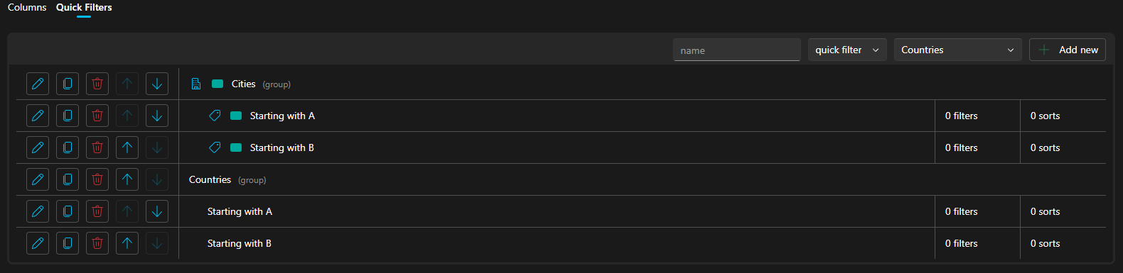
- Quick Filters: Presents a list of predefined data filters that will appear as tab navigation within the space view for users.
Space view column
All columns in a space view (except the first) are manageable. You can configure the displayed data, its order, the component used for presentation, column styling, title presentation, and more. Column creation and management are performed within the "Columns" section of the space view management screen.
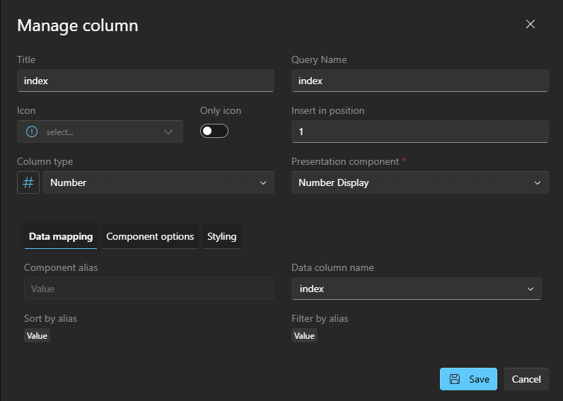
In the modal form, you can specify the following:
- Title: The label displayed for the column in the table header.
- Query name: An alias for the column, used in the URL (e.g., for filtering or sorting).
- Icon: An optional icon to display in the column title.
- Only icon: Display only the icon in the column title, without text.
- Insert in position: The desired position for the column in the columns list (after the initial system column). Selecting a new position will reorder all subsequent columns.
- Column type: The expected data type for this column. This can be a standard data type or a custom type defined by an addon (e.g., "Talk Comments Count"). This selection determines the available presentation components.
- Presentation component: The widget used to display the data in the column and during export. This can be a standard component or one provided by an addon. Choose the component that best suits the data.
- Data mapping: Maps the data aliases of the column type and its presentation component to specific columns in the dataset. For example, setting the "Value" data alias of a component to a selected dataset column.
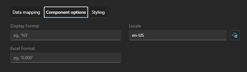
- Component options: Configuration options provided by the selected presentation component, allowing customization of data presentation.
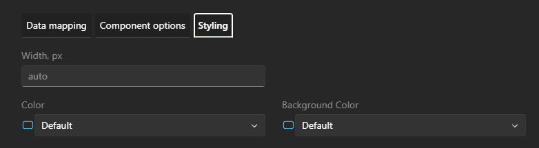
- Styling: General styling options to set the column's exact width, font color, or background color.
Space view quick filters
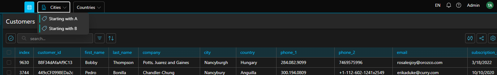
Quick filters enhance data review by providing predefined filters that present specific subsets of data. These filters appear as a navigational menu at the top of the space view.
They can be organized hierarchically using:
- filter group: A container that can hold both filter groups and quick filters as child items. Filter groups are used for navigation purposes only and do not display data directly.
- quick filter: A filter that displays data when clicked. Quick filters can be nested within filter groups or presented directly in the top-level navigation.
Here is an example of a quick filter definition and how it looks
Delete a space view
To delete a view, navigate to its management screen and press the "Delete" button.